
Chatbot buttons and airport signage
How a well-designed set of quick replies can be crucial to your bot's success

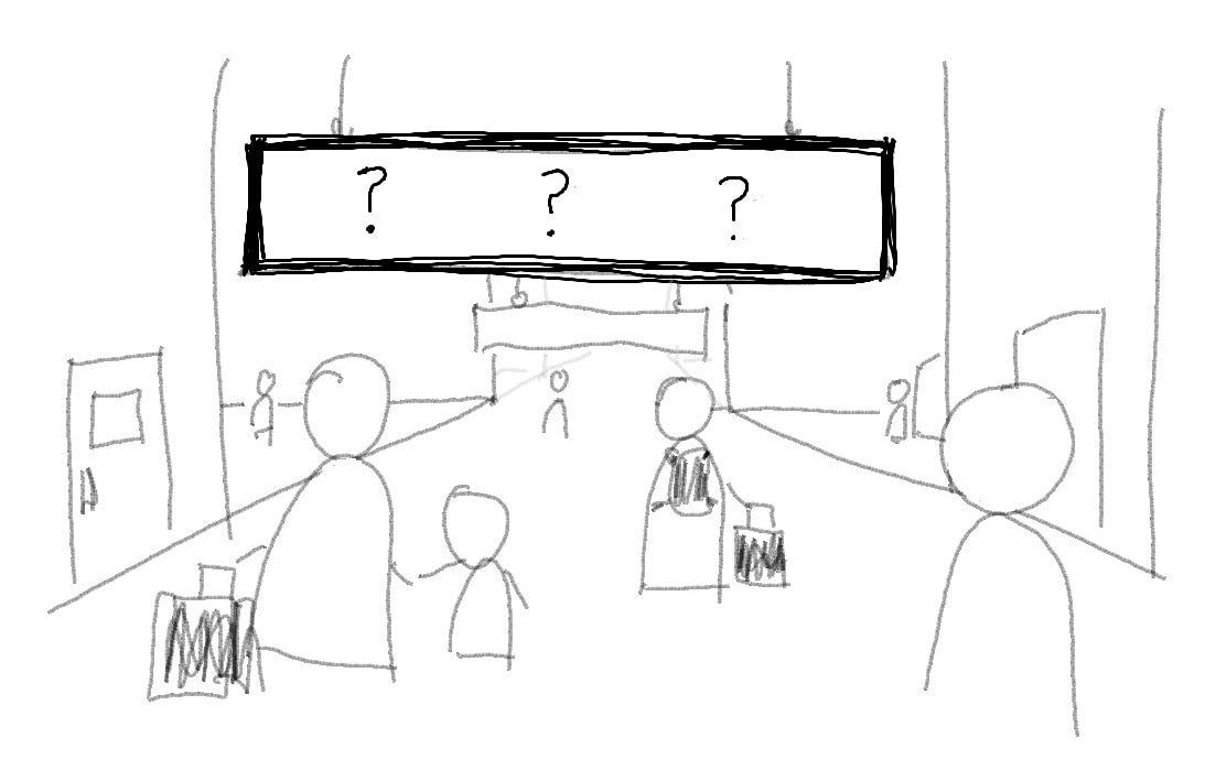
Here’s a scene: You’re walking around in an airport, and you see a sign like this. What does it say?
Probably something like this:
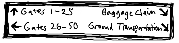
Well, of course. And it seems simple, doesn’t it? But let’s really think about what goes into planning signage like this.
First, we expect them to cover all the options. It should be a menu of all the possibilities—or at least, in conjunction with smaller signs for things like restrooms and such. If the sign didn’t mention how to get to the gates, for example, then at best the info desk would be overwhelmed, and at worst people would wander around absurdly, missing flights and getting angry.
Second, the labels should be clear. It’s called “Baggage claim”, not “Get your stuff” or “Cargo hold unloading chute endpoint” or something weird like that. Part of this is convention, which is circular reasoning—we call it “Baggage claim” because everyone else does and that’s what people expect. But, that’s exactly why we should follow suit.
Third, the options should be mutually exclusive. There are lots of kinds of transportation options around an airport. Can you imagine if the sign just said “Go places”? Like…on a plane? Then you’re looking for your departure gate. Somewhere in your destination city? Then you want the bus, or tram, or the curbside spot where your friend can pick you up.
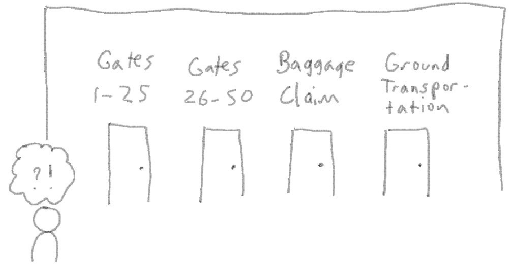
So put all these factors into play and we get a system of signs that does as good a job as possible of getting people from the airport’s entry point through the different parts of the airport in sequence (check-in/security/departure gate, for example, or restroom/baggage claim/ground transport).
A chatbot is no different. Its basic function is to get people from the entry point—starting up the chatbot because they have some sort of question—to the solution or answer they’re looking for. So why not design a chatbot in the same way?
Here’s where the humble quick-reply button comes in. Or rather, the set of quick-reply buttons, because the key to designing a chatbot is to plan it as a system whose parts are designed to work together to accomplish the goal of getting people where they’re trying to go. More on the system stuff in part 2 of this article, so stay tuned.
We’re all very focused on conversational AI and LLMs and all that these days, trying to find better and better ways to figure out what people need based on what they type. But what if someone didn’t need to type at all, just clickety-click and they get where they need to go? The set of buttons that the chatbot presents to users is an undervalued element of chatbot strategy. After all, if you come into the airport and see what you want right there on the sign, you don’t have to stop at the info desk to ask where to go. Likewise, if a user starts up your chatbot and you’ve given them a useful set of buttons to start off the interaction, they’re off to the races, no interpretation necessary. NLU intent recognition equivalent: 100%.
Of course, the functions of most chatbots, at least the large-scale retail chatbots that I’m most familiar with, tend to be more complex than the routing within an airport. For one thing, most people know what to expect at an airport, so they’re primed to look for the major functions. For another, an airport offers physical and spatial cues that are absent in a chatbot. For example, we expect to move farther from the entrance as we go through security and to our gate, so the way the space is set up helps us guess where to go. Likewise, baggage claims tend to be on lower levels, so after experiencing a few airports we might guess that the down escalator is more likely than the up escalator to get us to our bags. These are patterns that we’ve either learned or can intuit about airports.
A chatbot, on the other hand, has no information other than exactly what you see on the first screen. There’s no good way to guess anything else, a problem which in UX jargon is called “low discoverability”. There are no spatial cues or any other contextual information, and if the user isn’t already familiar with your business, no way to even guess what they might be able to do within the chatbot or with your business overall, other than literally what you tell them. Take away the spatial cues and you suddenly feel much less confident making a choice. Will this really get me where I want to go? How far is it away? Can I go back if I make a mistake?
Think about it this way, and suddenly the importance of a well-designed set of chatbot buttons becomes clear. Add in the fact that your users might be frustrated before they even start the interaction--because they have a customer service problem, because they already hate chatbots, or both—and the stakes start becoming evident.
So…what is a conversation designer to do about all this?
In part two of this article, I’ll talk about some practical ways to design an effective routing system within your chatbot.
That spatial clue thing really resonates with me.